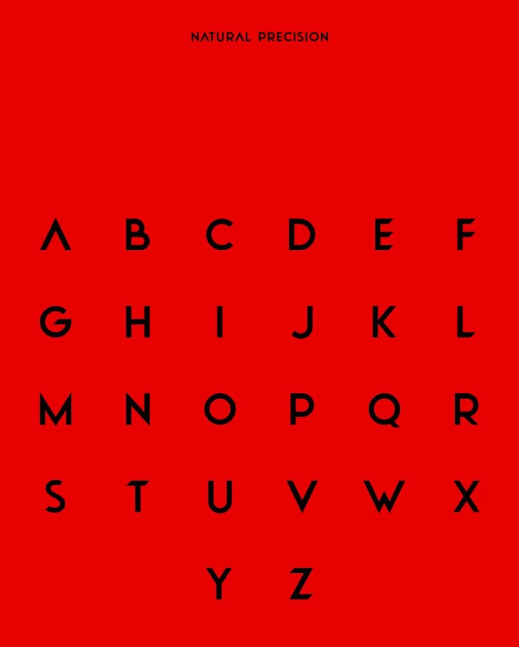


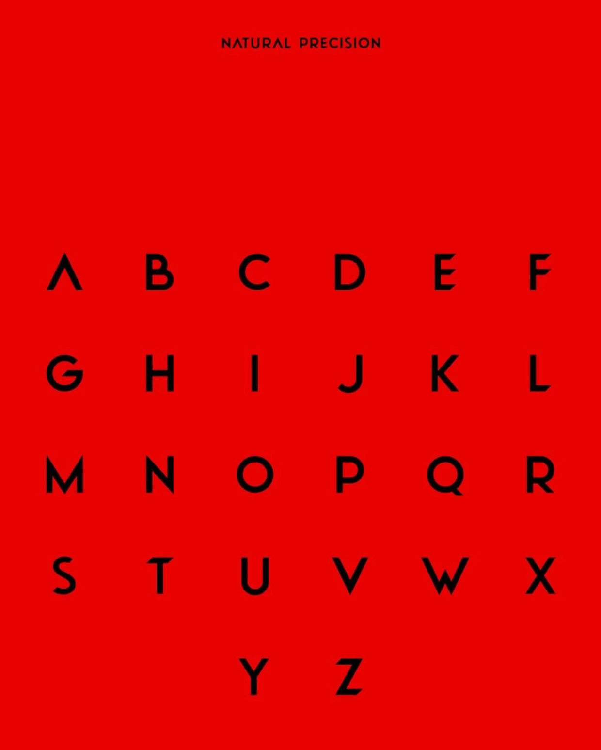
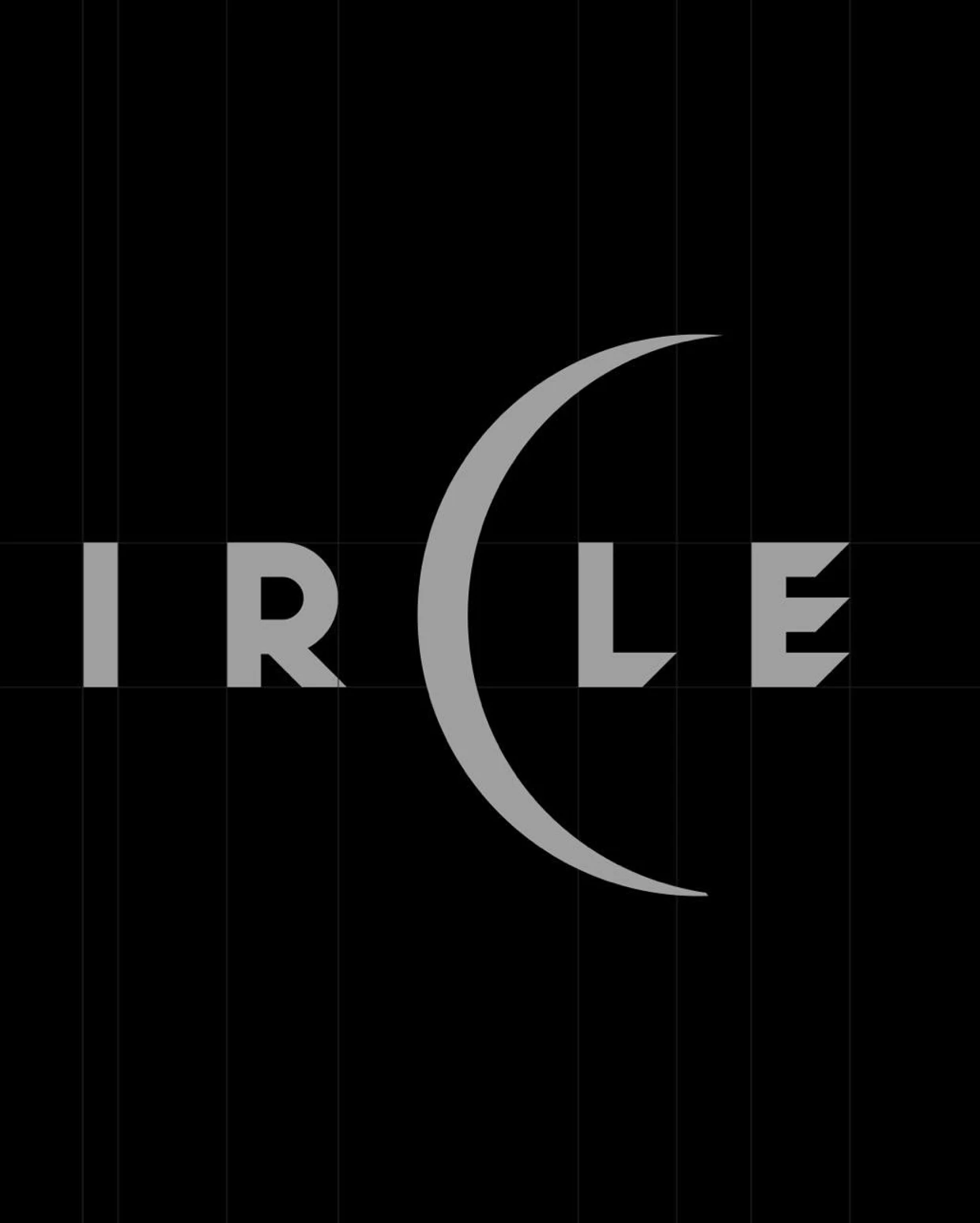
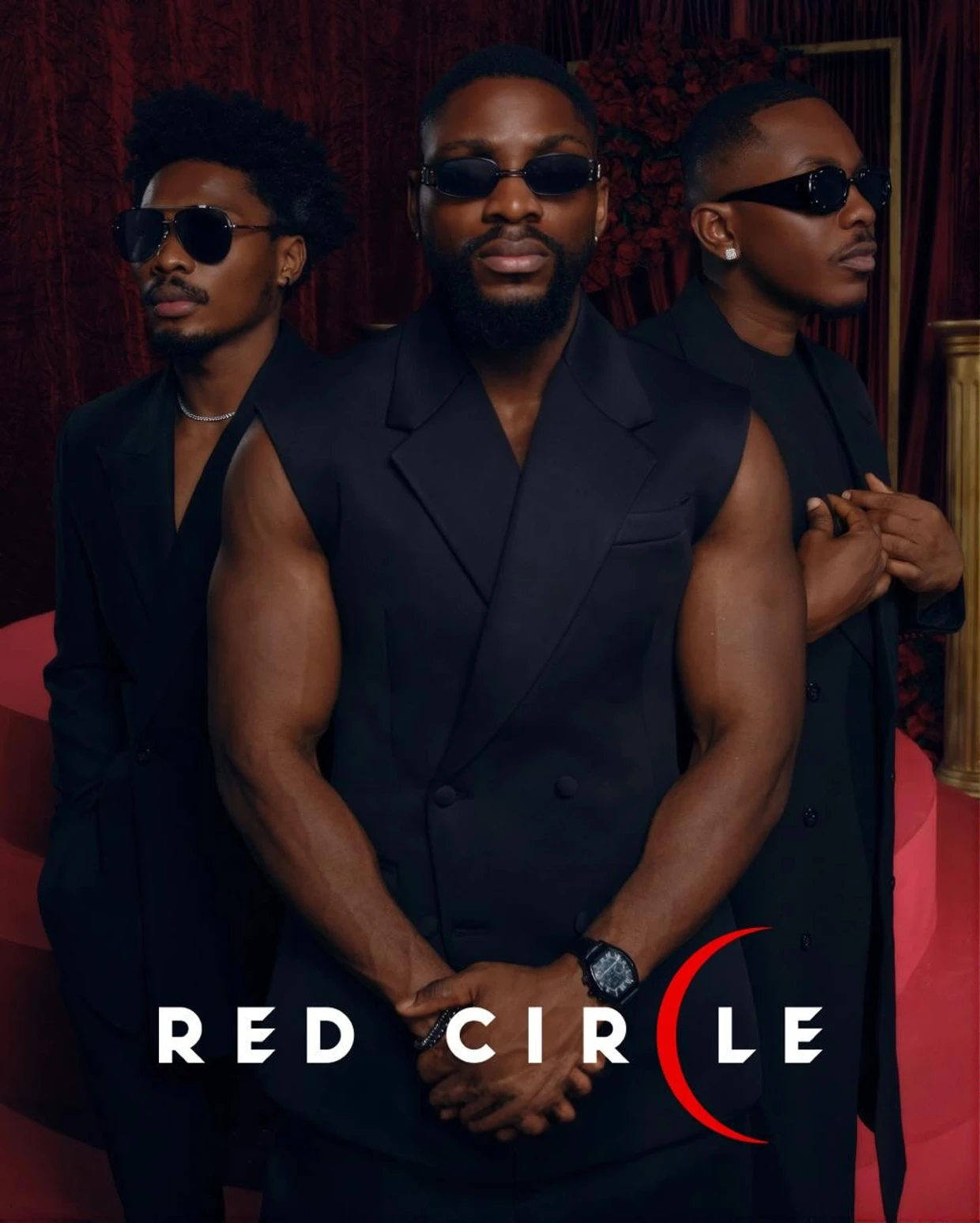
Visual artist Kanayo Uzo brings a clever use of typography to his logo and title design for Red Circle. One of the most interesting details is how the letter C becomes a glowing crescent, playing with the project's name while giving the identity a distinctive look. The crescent stands out as a simple but thoughtful detail, bringing another layer of meaning to the composition without making it feel complicated. It's a good example of how a small typographic decision can shape an entire visual identity.
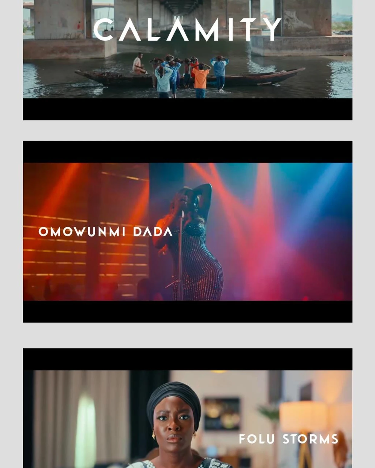
This attention to detail runs through much of Kanayo's work. Whether he's working with typography, physical objects, or photography, there's a recurring interest in how form can communicate an idea. His projects may look different from one another, but they share a considered approach to composition, colour, and the experience of the viewer.

That same thinking comes through in his custom award design for AIESEC. Where Red Circle uses a subtle change in lettering to communicate its concept, the AIESEC project explores how an idea can take physical form. Through clean lines, carefully considered shapes, and lighting, Kanayo translates the idea of looking forward into an object people can hold and interact with. Both projects show his interest in making concepts tangible, even when the final outcomes are very different.


His personal photography offers another perspective on this approach. Away from the more structured requirements of identity design, Kanayo explores human emotion, texture, shadow, and everyday experiences. There's a similar sensitivity to form and composition, but with more room for observation and experimentation. These explorations also provide some context for his commercial work, where visual decisions often carry meaning beyond their immediate appearance.
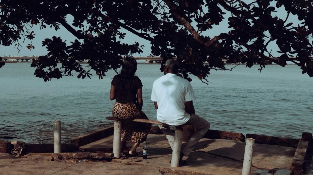
This relationship between design and human experience is something Kanayo has spoken about publicly. During an episode of Wine & Design by Untitled Designers Community, he discussed design as something that goes beyond websites and applications, describing it in terms of care and love. It's a perspective that helps connect the different parts of his practice, from creating identities that communicate clearly to making objects and images that invite people to feel or think about something.


Looking across these projects, what stands out isn't simply Kanayo's ability to work across different mediums, but the way he approaches them. The crescent in Red Circle, the physical form of the AIESEC award, and the quieter observations in his photography all reflect an interest in communicating ideas through deliberate visual choices.