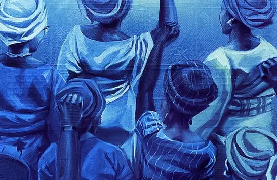


In a world where most fintech designs look the same, this one really stands out. Mono’s OWO makes sending money as easy as sending a message on WhatsApp, but Belonwus took that smart payment idea and turned it into a brand that feels warm, confident, and truly Nigerian.
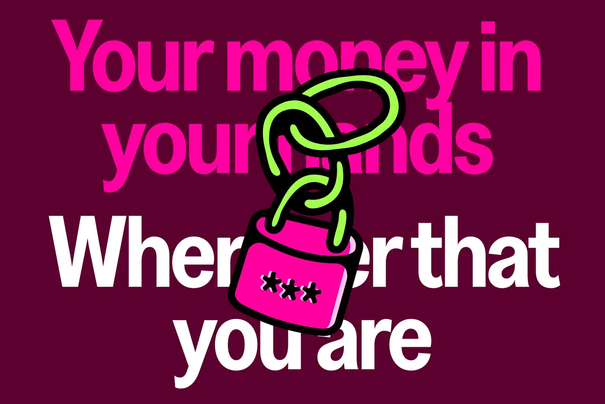
The main idea they focused on is simple but brilliant: “Your money in your hands, wherever you are.” It might sound basic, but this idea shaped six months of hard work, from planning to the final design. Belonwus knew that OWO isn’t just about money—it’s about how we talk with friends and family. So, the look had to feel familiar, safe, and exciting all at once, especially in Nigeria’s busy fintech market where everyone’s trying to get noticed.
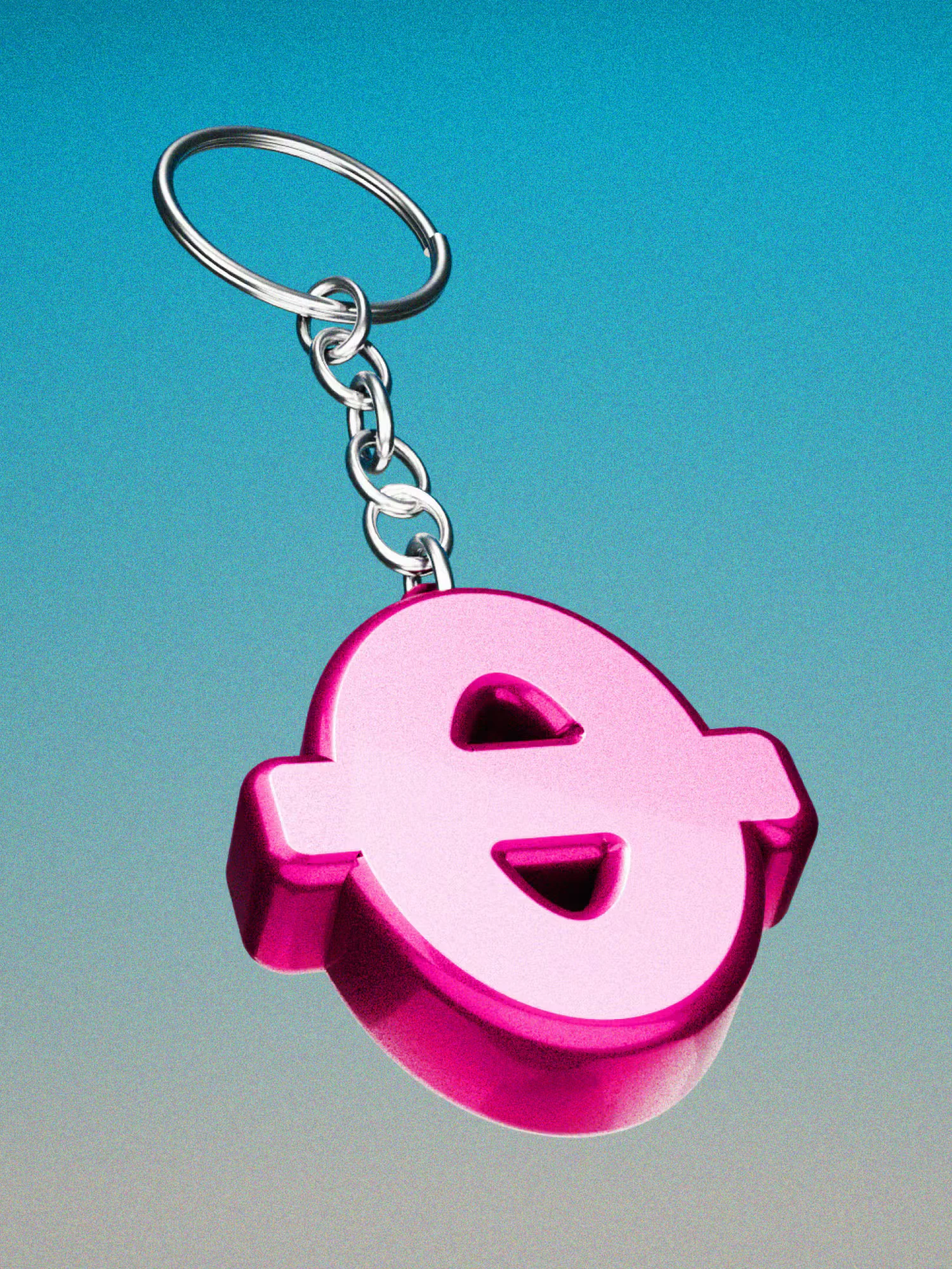
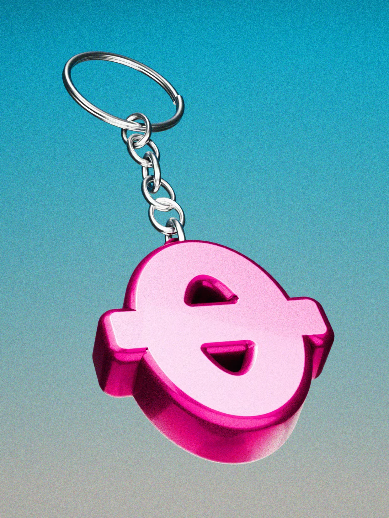
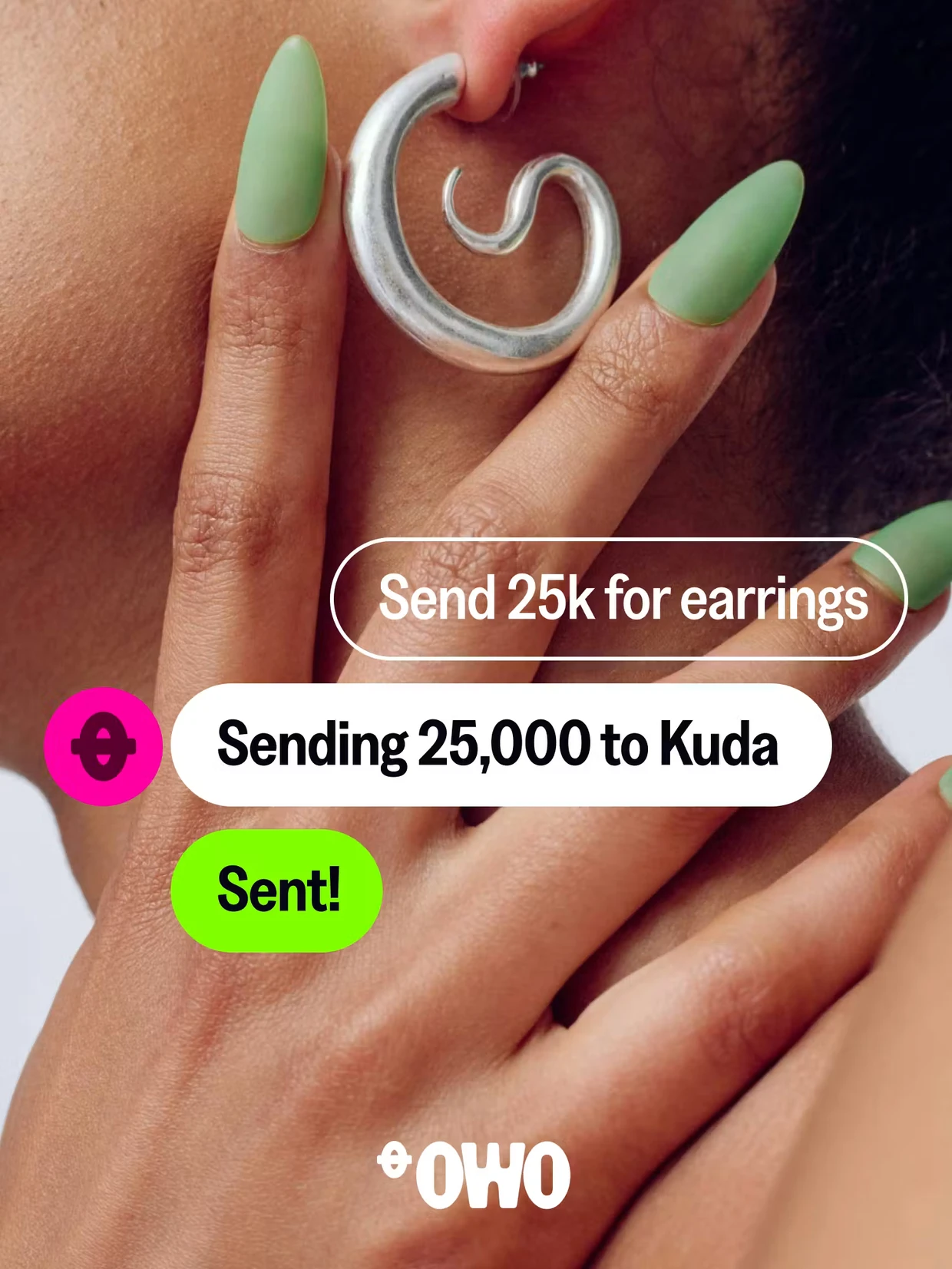
A key part of the new look is the “dash” symbol, inspired by how we write money amounts like ₦1,000.00. Belonwus turned this small punctuation mark into a strong design element that connects the logo, layouts, icons, and even outdoor ads. It ties everything together, making every part of the brand feel connected and intentional. You’ll see it guiding your eyes on social media posts, chat screens, and more, turning a tiny symbol into something memorable.
Then there’s the fold system, inspired by how Nigerians fold naira notes in daily life—by bus conductors, market sellers, and more. Belonwus turned this everyday action into a creative design style with folds, creases, and shapes that move like origami. In animations, these folds come alive in 2D and 3D, giving the brand energy and warmth that feels deeply Nigerian.
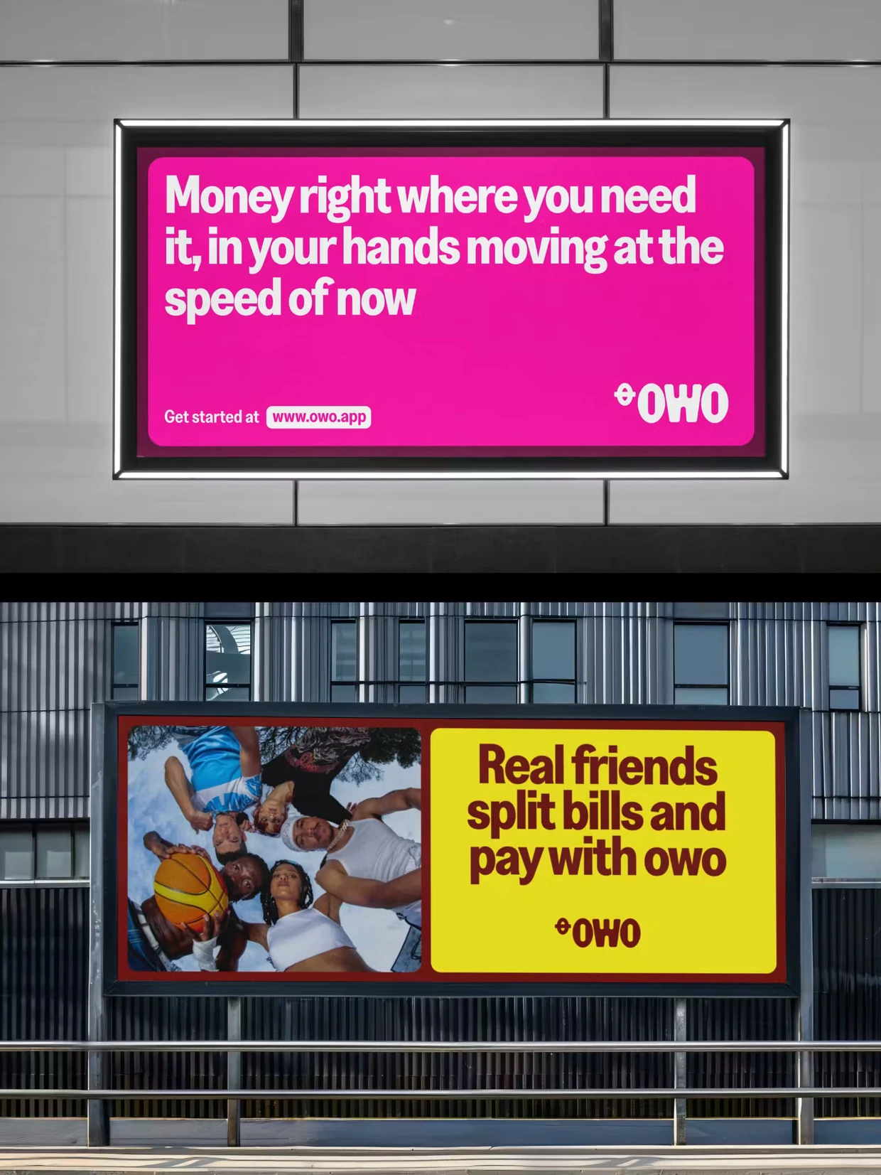
The colors are where Belonwus really took a bold step—and it worked great. Instead of safe, usual colors, they chose Money Pink as the main color, paired with deep Burgundy. No other Nigerian fintech uses pink with this much confidence and personality. The colors are bright and lively, making OWO stand out while still feeling trustworthy and strong. It makes money feel fun and joyful, not cold or boring.
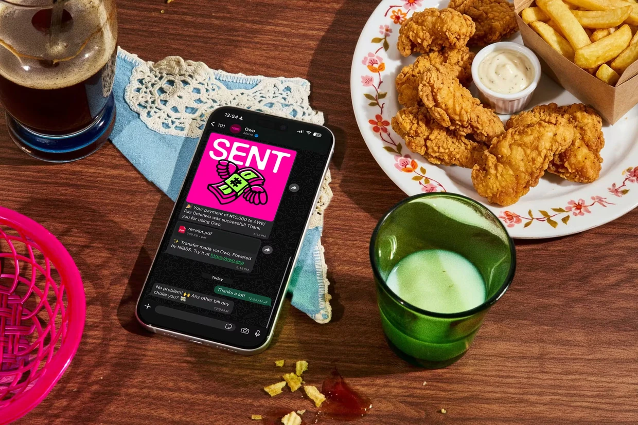
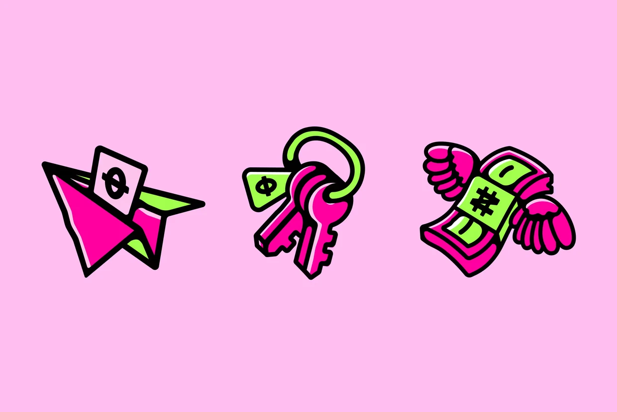
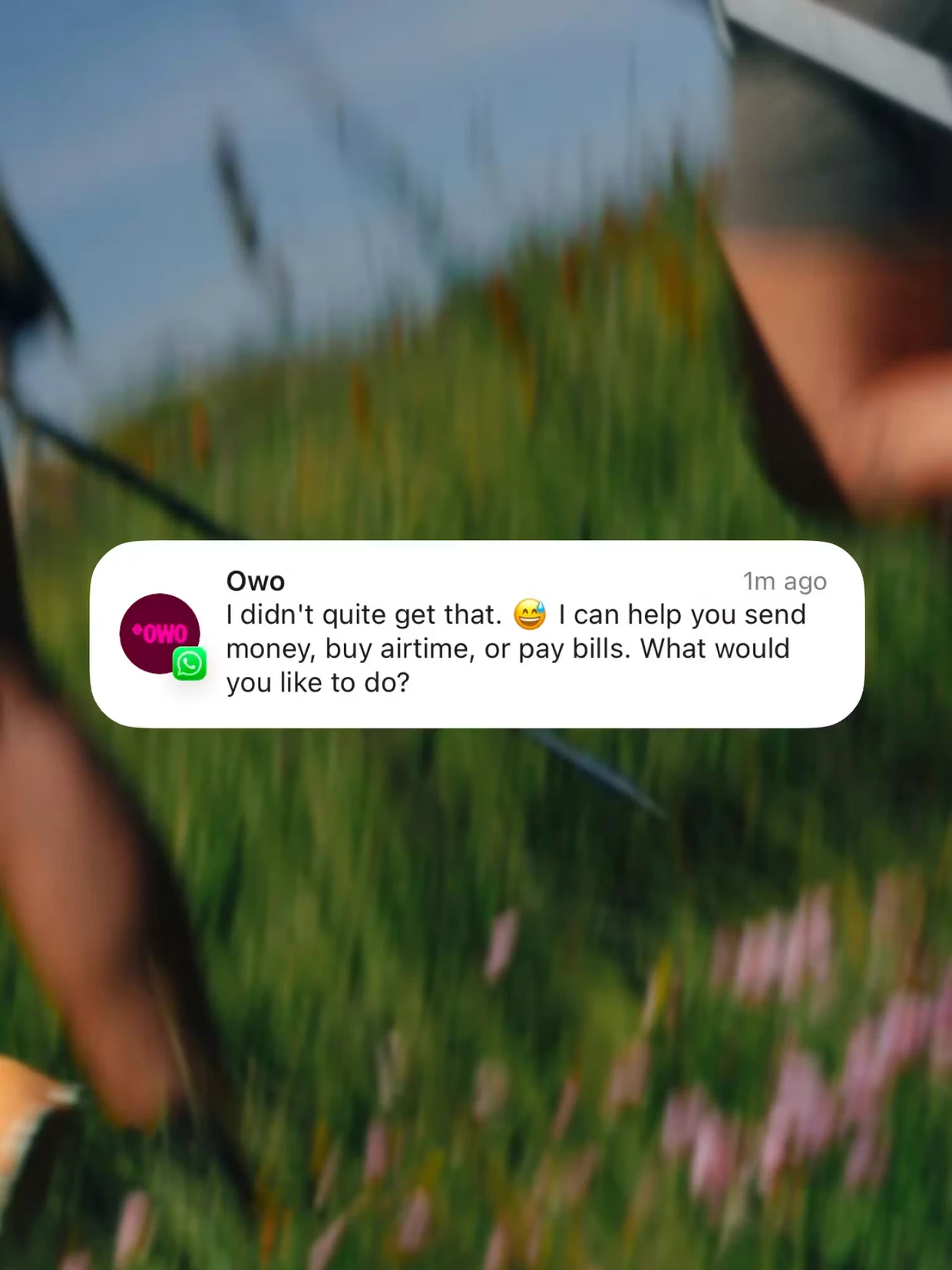
The illustrations are another highlight—hand-drawn with simple, clever ideas that explain things quickly and clearly. They kept the drawings warm and easy to relate to, without making them too busy. Together with the clean, consistent icons, everything looks good whether you see it in a chat, on Instagram, or on a website. The animations add a nice rhythm and flow, never feeling fake or over the top. Belonwus made sure OWO feels like a trusted friend—friendly, reliable, and never pushy. This tone is consistent everywhere, so using OWO feels smooth and natural, like quickly asking for money in a group chat and watching it happen right away.