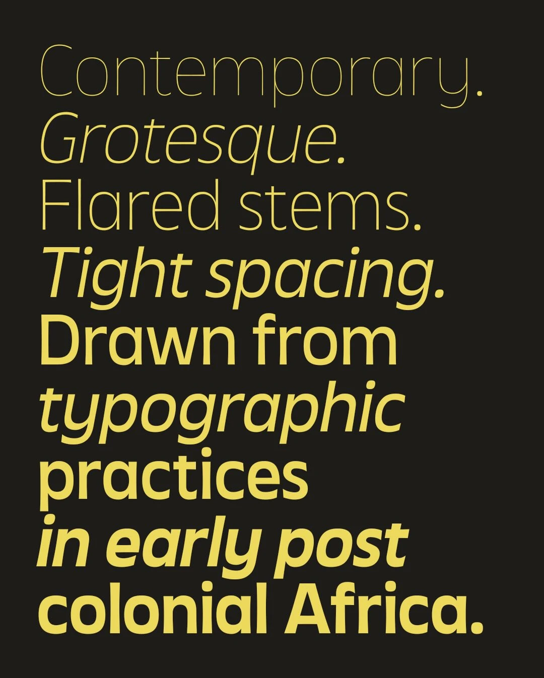


When we talk about "Grotesque" fonts, the conversation usually leans toward European rigidness. However, Joboson Chisa challenges that standard with Touki Grotesk, a contemporary sans-serif rooted in the typographic language of early post-colonial Africa. Named after the Wolof word for “journey,” the typeface is an intentional study of how the Latin script was reinterpreted across African cities in the mid-20th century, shaped by local materials, hand-painted signage, and vernacular print culture.
The design of Touki Grotesk manages a difficult balance: it retains the clarity of classic geometric models while integrating the "imperfections" of hand-crafted lettering. You see this in the open apertures, compact proportions, and the subtle flare of the stems. Rather than just mimicking the past, Chisa extends it—refining those improvised, bold strokes into a functional system that works for modern editorial and branding needs.
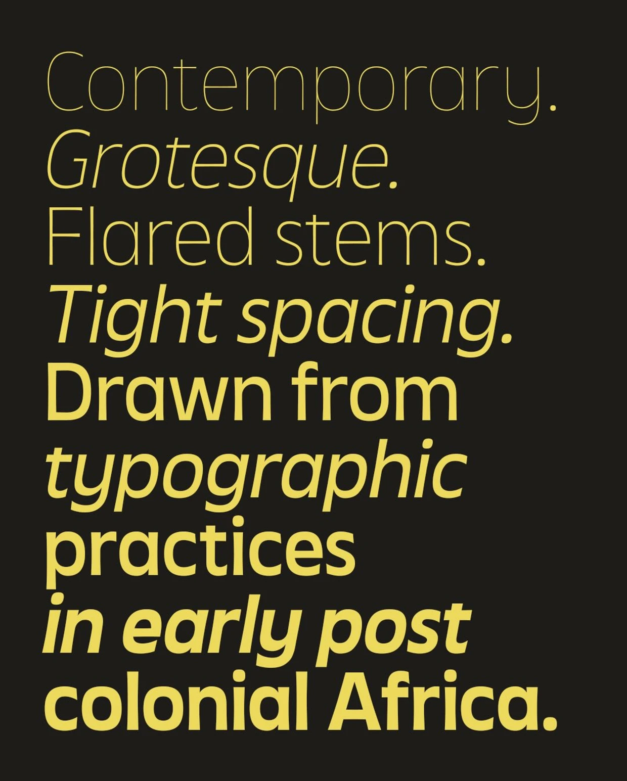
Technically, the release is expansive. Version 1 includes 14 styles and provides support for over 820 Latin-based languages, making it a viable tool for global communication that doesn't sacrifice its specific cultural soul. The project moves beyond mere nostalgia; it treats African vernacular design as a sophisticated foundation for high-end digital type.
Ultimately, Touki Grotesk is a reminder that the history of African design isn't just found in museums, but on the streets and in the archives of our early independence era. By digitizing these visual rhythms, Chisa is providing a new generation of creators with a toolkit that is grounded in our own history, while remaining versatile enough for contemporary use. It’s an invitation to look at our own typographic heritage as a global standard.